Building a React Card Layout with Accordion Feature and Animations
Creating beautiful, clickable cards with smooth animations.
Are you looking to create an engaging card layout with an accordion feature in your React application? Look no further! In this blog post, we'll walk through how to build a TypeScript file that defines a React component called BasicCardLayout. This component utilizes several other components to construct a dynamic card layout with an accordion feature, complete with animations for a polished user experience.
Understanding the BasicCardLayout Component
The BasicCardLayout component is the cornerstone of our card layout. It accepts four props:
title: A string representing the title of the card.
description: A string representing the description of the card.
link: A React node representing a link to be displayed in the card footer.
children: A React node that serves as the trigger for the accordion.
Component Composition
Inside the BasicCardLayout component, we leverage other components to construct the layout:
Card: This component forms the foundation of our card layout.
CardHeader: Used to create the header of the card.
Accordion: Implements the accordion feature within the card.
AccordionItem: Contains an AccordionTrigger and an AccordionContent.
Animating the Card Content
One of the key features of our card layout is the animations applied to its content. We utilize the framer-motion library to achieve smooth animations. Here's how it works:
motion.article: Wraps the content of the card and is responsible for animating its sections.
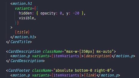
CardTitle: Displays the title prop with a slide-in animation.
CardDescription: Displays the description prop with a fade-in animation.
CardFooter: Displays the link prop with a fade-in animation.
Animation Control
The animations are controlled by two objects:
visible: Defines the properties of the animation when the content is visible.
itemVariants: Defines the properties of the animation when the content is hidden and when it is visible.
Summary
In summary, the TypeScript file we've built defines a versatile card layout with an accordion feature and animations for the title, description, and link. By passing the content as props to the BasicCardLayout component, developers can easily create visually appealing card-based interfaces in their React applications.
With this guide, you're equipped to enhance user interaction and engagement by incorporating dynamic card layouts into your projects. Happy coding!


Master of the codes